
 USD
USD
[Tutorial] How to Integrate PODpartner Customizer with Shopify

![[Tutorial] How to Integrate PODpartner Customizer with Shopify](https://img.podpartner.com/static/CmsFiles/EU_38_Bp_E4sz_Bzr_Do4_Rs_Mo_ZN_f75d511578.png?updatedAt=2025-12-05T10%3A40%3A14.869Z)
This guide focuses on the crucial step of integrating the PODpartner Customizer into your Shopify product pages. While setting up customizable products and configuring custom settings in PODpartner lays the foundation, the true power of customization comes alive when customers can seamlessly interact with customization options right on your product pages.
The PODpartner Customizer integration is a one-time setup process that enables all your customizable products to display professional, branded customization interfaces.
Part 1: Adding PODpartner Customizer to Your Shopify Product Page
Before proceeding with the integration, ensure you have completed the prerequisite steps: you must have already synchronized a product template containing custom layers and configured its Custom Settings in your PODpartner dashboard. With these foundations in place, you're ready to integrate the customizer into your Shopify storefront.
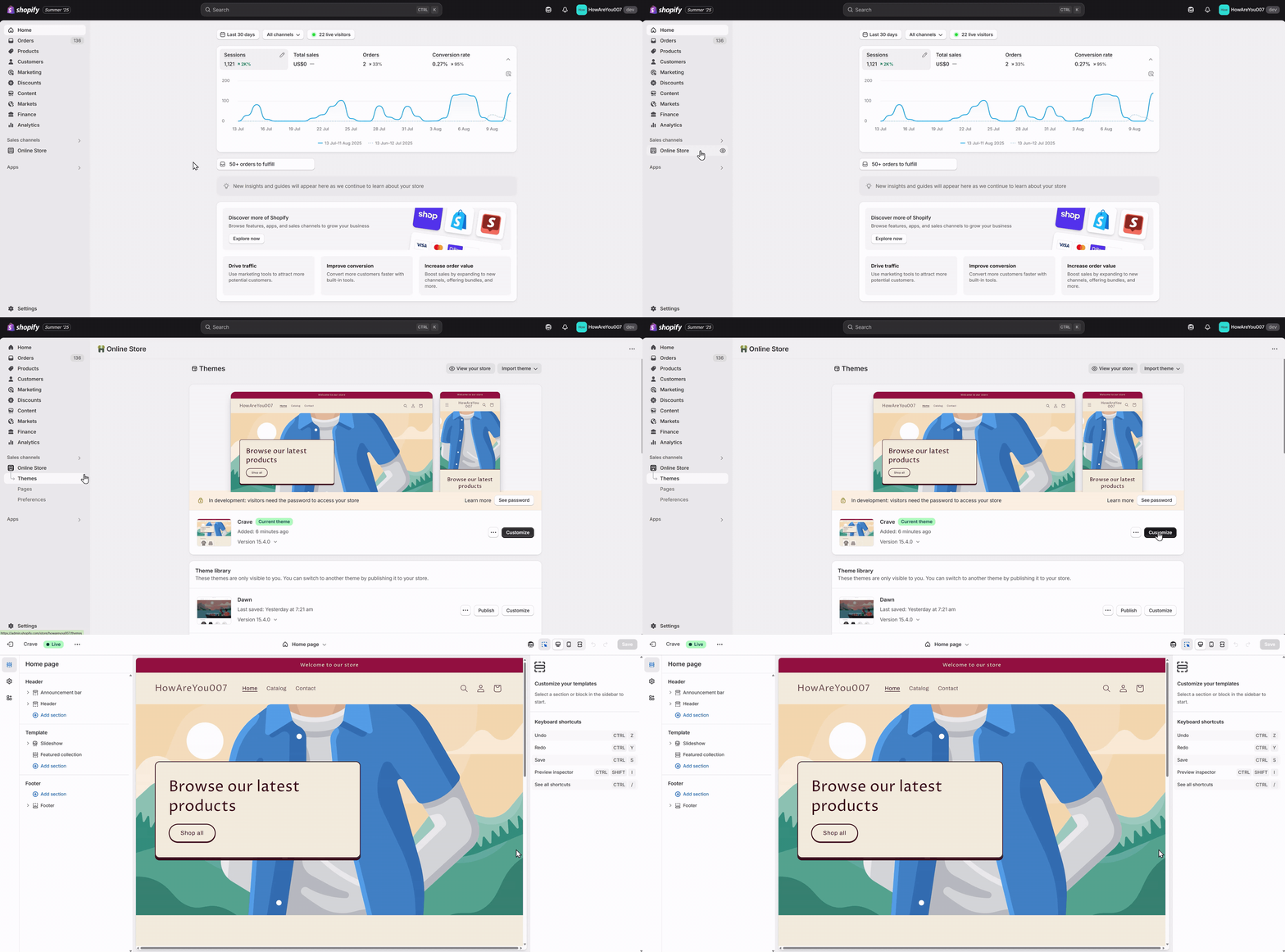
Step 1: Access Your Shopify Theme Editor
From your Shopify admin, navigate to Online Store > Themes. Find your current theme and click the Customize button to open the theme editor.
The theme editor provides a live preview of your store alongside customization options, making it easy to see changes in real-time as you make them.
Step 2: Navigate to the Product Template
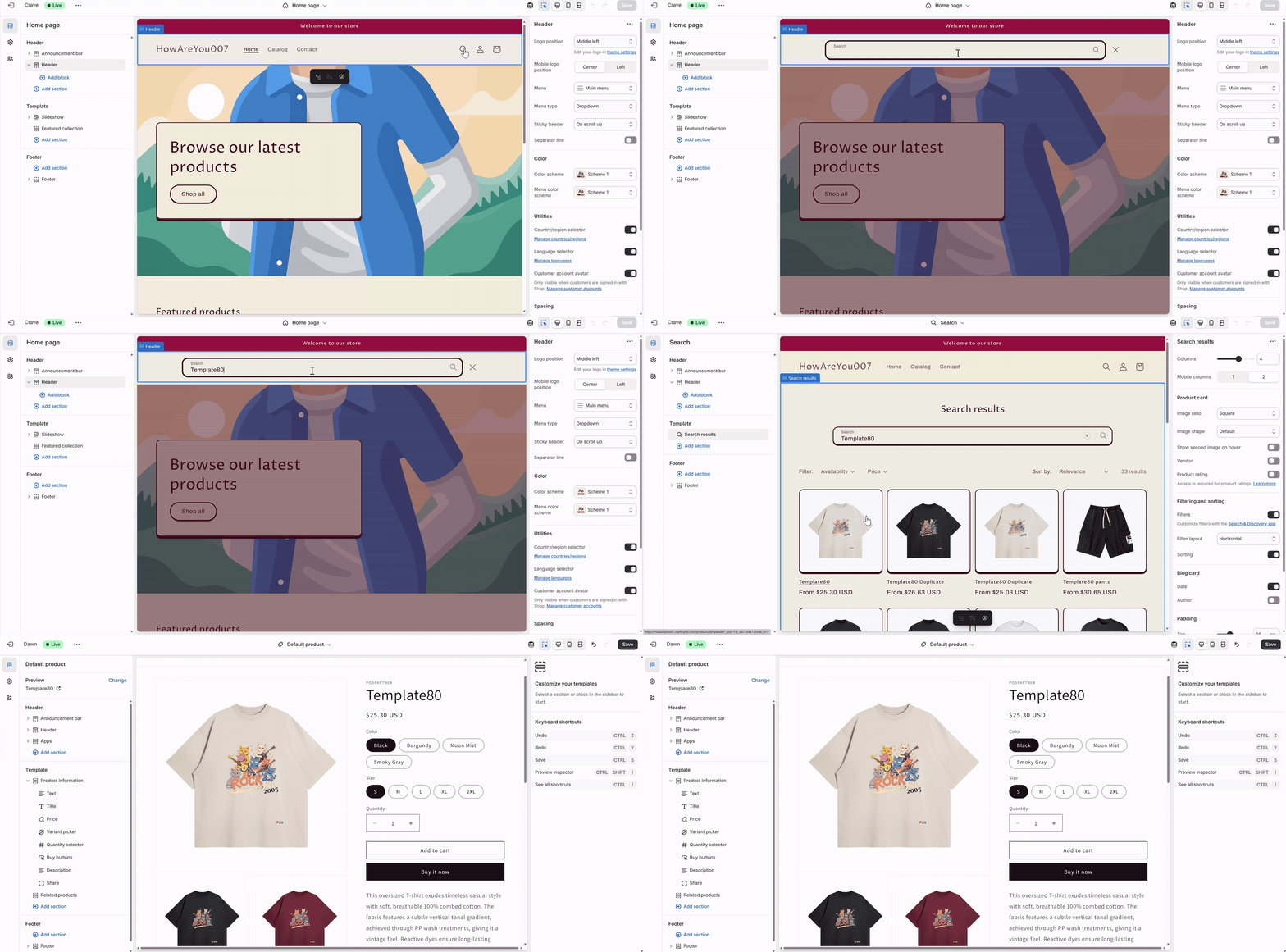
In the theme editor, navigate to a product template where you want the customization options to appear. The Customizer is designed to work specifically on product pages.
Step 3: Add the PODpartner Customizer App
On the product page template, look for an area where you can add the new section. Click the "+ Add section" button, which typically appears when you hover over different areas of the page layout. From the dropdown menu that appears, navigate to the "Apps" section. Select "PODpartner Customizer" to add this specialized section to your product page. This action integrates the customization functionality directly into your product template that contains custom layers.
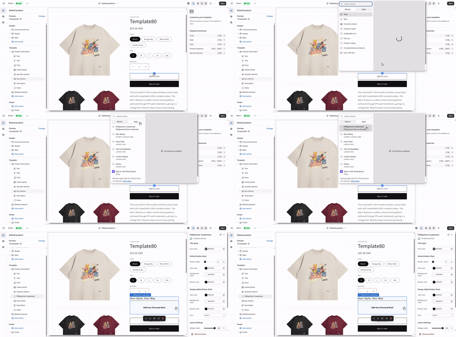
Once you've added the customization option, you can adjust its appearance to match your brand's aesthetic. The next step is to style it to blend seamlessly with your store's design.
Products without a custom layer, or those with custom layers but no custom settings made in PODpartner, will not display the PODpartner Customizer App after it is added to your store.
Part 2: Customizing the Appearance of the PODpartner Customizer
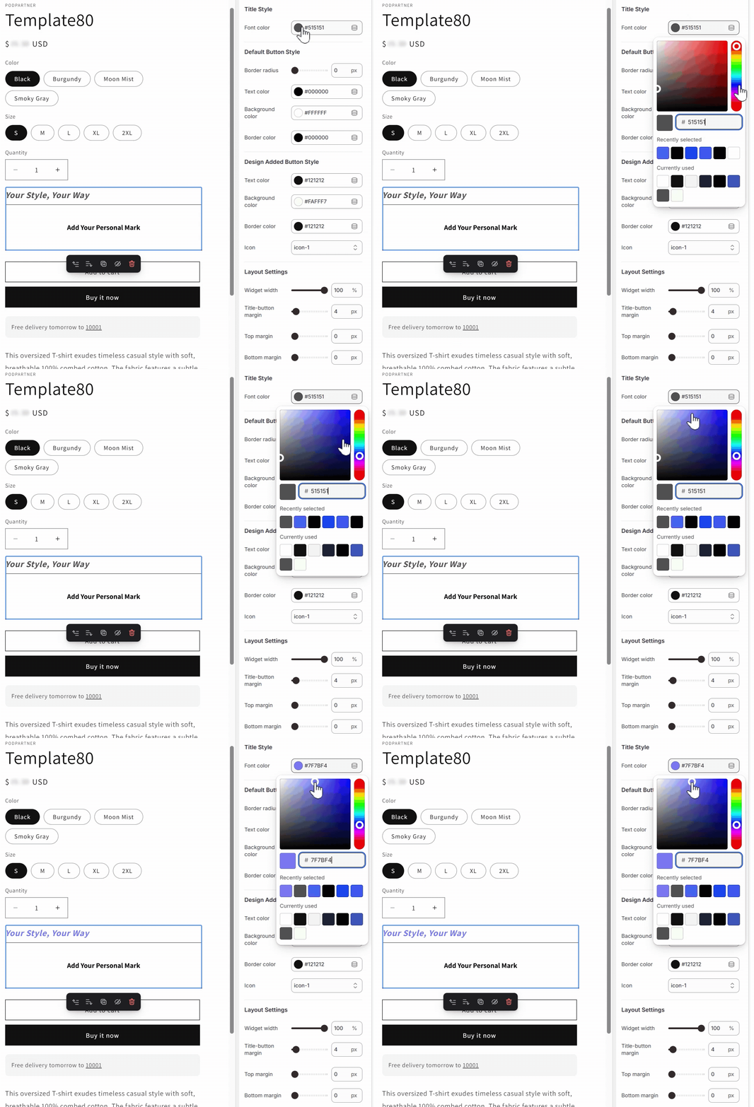
The Customizer's settings in the Shopify theme editor allow you to fine-tune its appearance, allowing you to create a cohesive brand experience that feels native to your store design. You can access these settings by clicking on the PODpartner Customizer block you just added.
Title Style
These settings control the look of the title for the customization option.
- Font Color: Choose a color that provides excellent contrast against your page background while aligning with your brand's color palette to ensure the customization option is clearly visible.
Default Button Style
This defines the appearance of the button before a customer interacts with it. This is the button your customers will click to open the customization tool.
- Color of Text, Background, and Border: These settings work together to create the button's visual appearance in its default state. Ensure text color provides excellent readability against your chosen background color, and select border colors that complement your store's design.
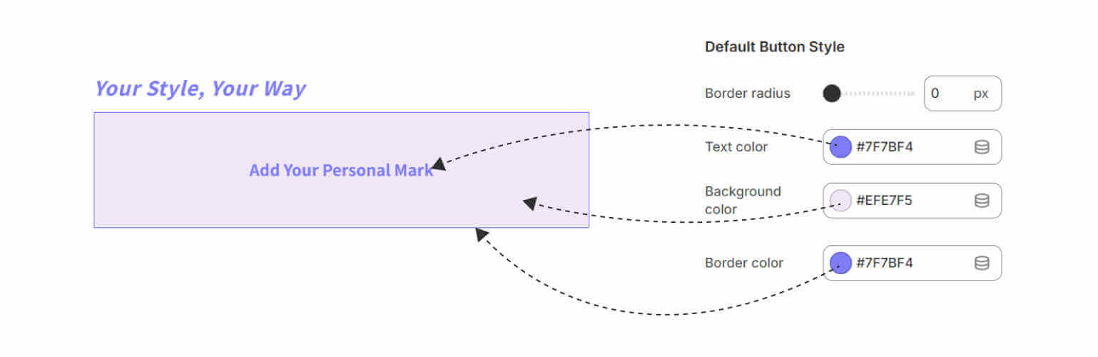
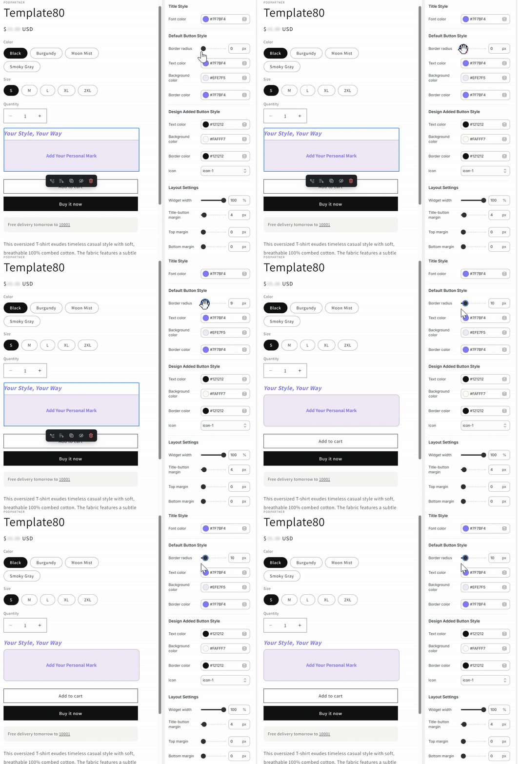
- Border Radius: This setting allows you to control the roundness of the button's corners. A value of 0 will create a sharp, rectangular button, while higher values will make it more rounded.
Design Added Button Style
This setting controls the button's appearance after a customer has successfully added their custom design. This provides visual feedback, so customers know their customization has been applied.
- Color of Text, Background, and Border: Just like the default button, you can set the colors for the text, background, and border. We recommend choosing a color that contrasts with the default button to clearly indicate a change has occurred.
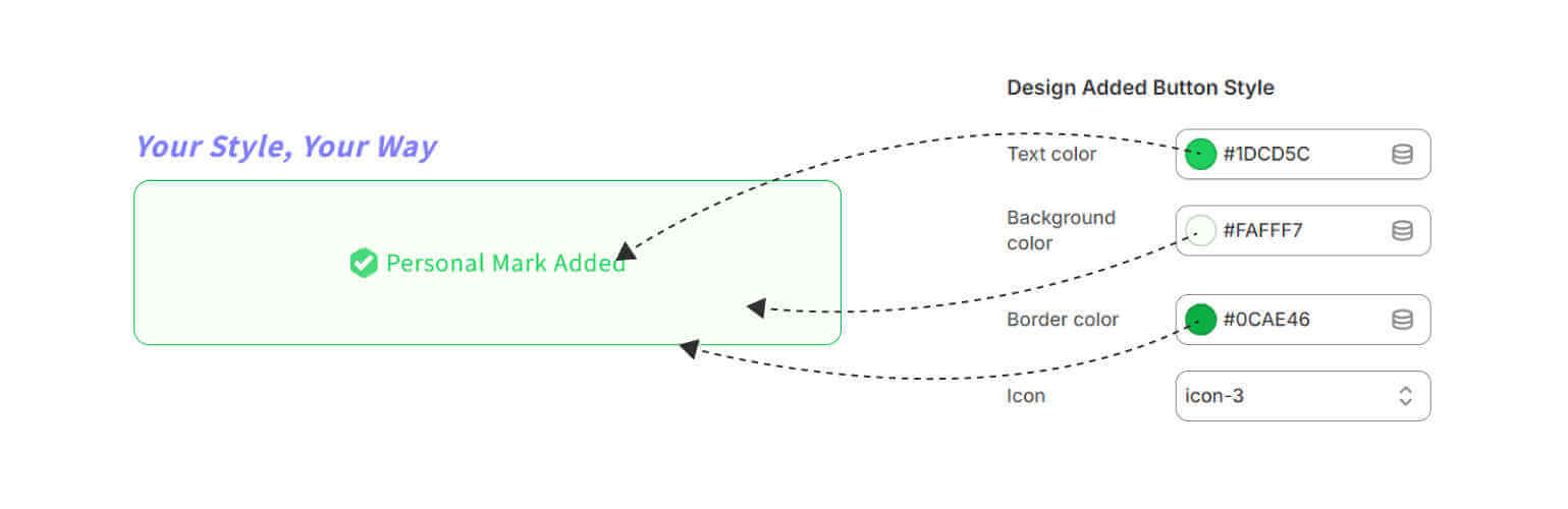
- Icon: Choose from 10 icon options to visually signify that a design has been added.

Due to the tedious process of previewing the Design Added Button Style directly within Shopify's Theme editor, it's recommended to adjust colors and icons in the interactive widget below, preview the results until satisfied, then apply the same settings in the Theme editor.
- Default Button Style
- Border radius
Copy code
- Text color
Copy code
- Background color
Copy code
- Border color
Copy code
- Design Added Button Style
- Text color
Copy code
- Background color
Copy code
- Border color
Copy code
- Icon
icon-1 icon-2 icon-3 icon-4 icon-5 icon-6 icon-7 icon-8 icon-9 icon-10 Copy code
Layout Settings
These settings control the spacing and size of the PODpartner Customizer on your product page.
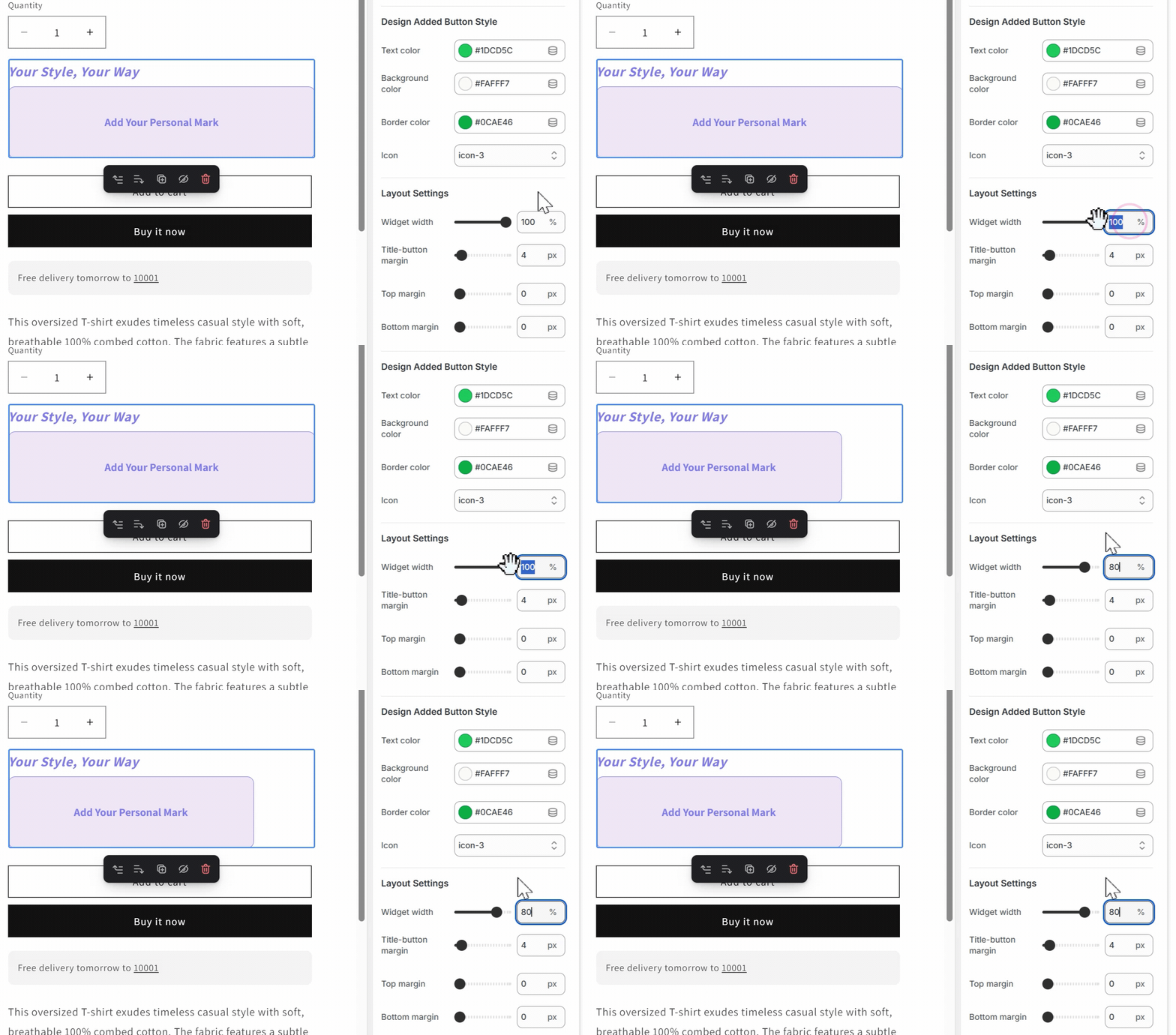
- Widget Width: Set the width of the customization section to match the surrounding elements on your product page.
- Title-Button Margin: This controls the space between the title and the button, allowing you to create a visually pleasing layout.
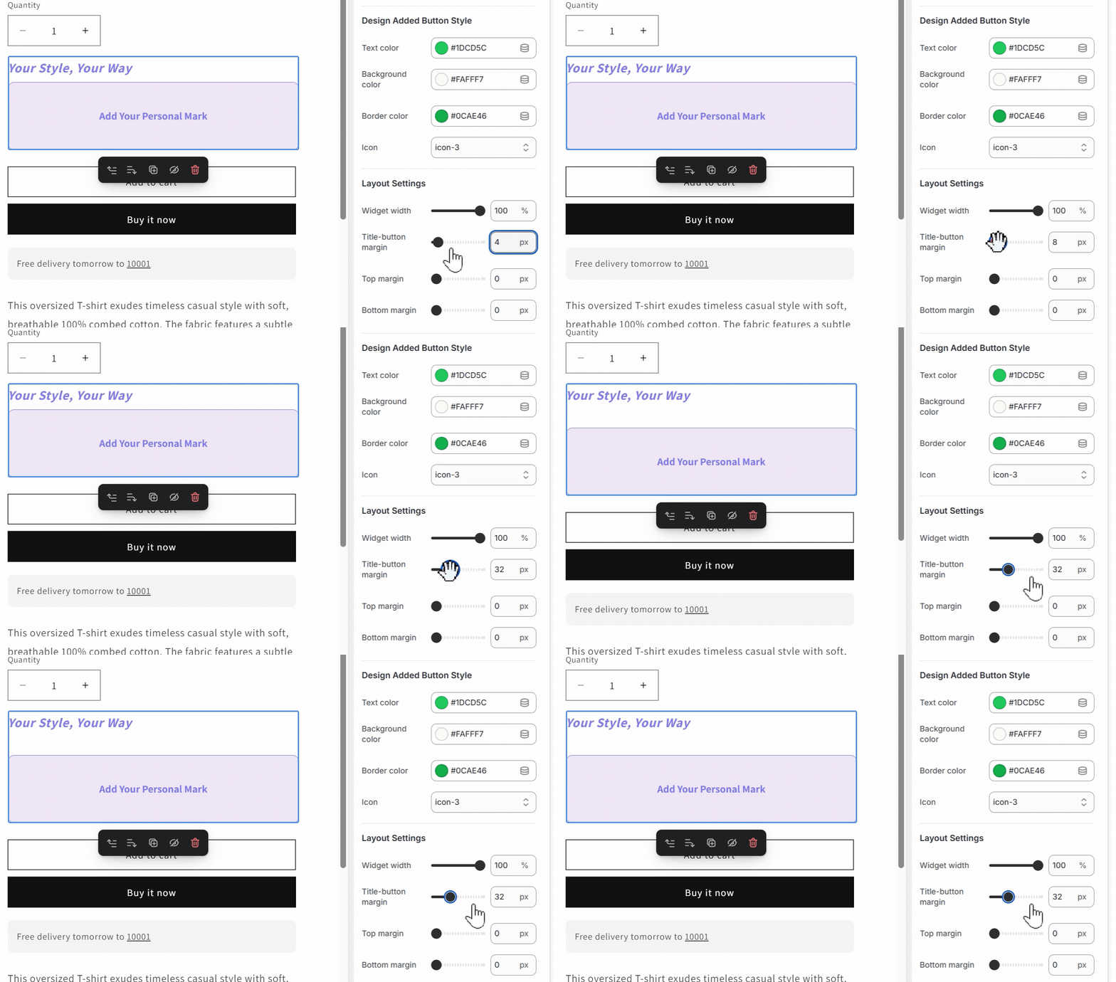
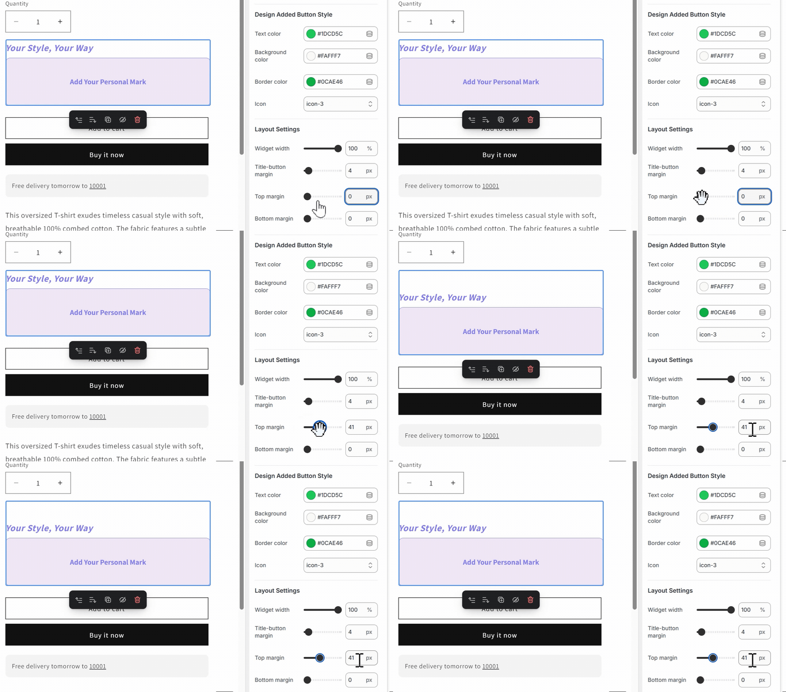
- Top Margin: Determines the space above the entire customization section, establishing visual separation between different product page sections for a clean, organized layout.
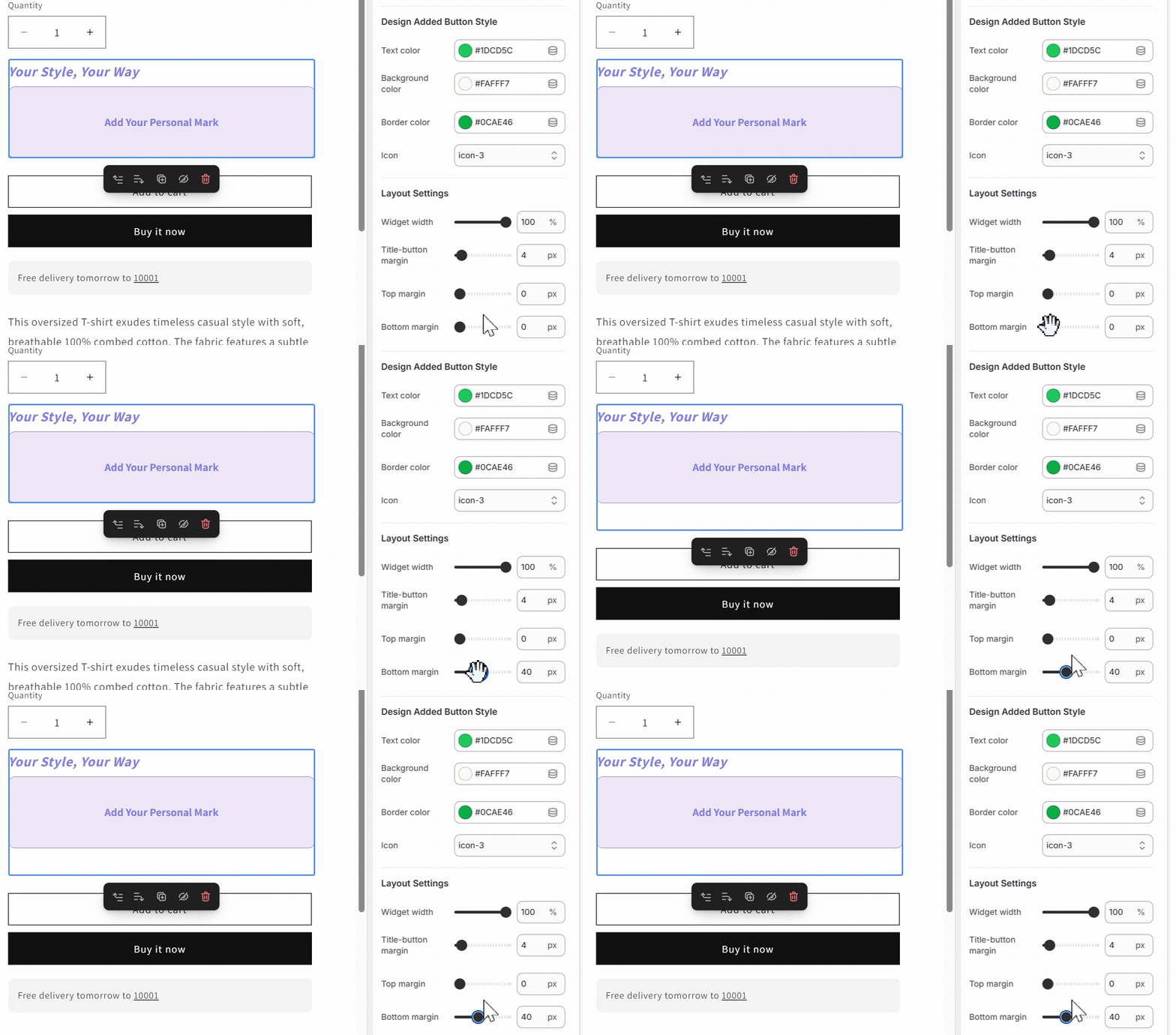
- Bottom Margin: Controls spacing below the customization section, affecting how the customizer relates to subsequent page elements.
Now that you have successfully integrated and customized the PODpartner Customizer, your customers can enjoy a smooth, intuitive experience. The customization options will feel like a natural part of your store’s design, creating a cohesive and engaging shopping journey.

No Order Minimums

No Membership Fees

No Unsold Stock

No Quality Concerns
Only Creativity, Satisfaction, and Profits!