
 USD
USD
Mastering the Jumbo Print: The Ultimate Guide to Preparing Artwork for 24″×24″ DTG


In the high-end streetwear market, the "Standard" 12×16 inch print is no longer sufficient. Leading brands like Balenciaga, Vetements, and Hellstar have conditioned consumers to expect massive, edge-to-edge graphics that dominate the garment.
For independent brands, the barrier has always been manufacturing. Most Print-on-Demand providers cap their output at 16″×12″. PODpartner has shattered this ceiling with our 24″×24″ (61cm×61cm) Jumbo DTG capability.
However, scaling up to a 24-inch canvas requires more than just resizing an image. It demands a strict adherence to technical specifications to ensure clarity, color accuracy, and a premium hand feel.
Here is the professional guide to preparing your files for the Jumbo stage.
1. Resolution & Dimensions: The 7200px Standard
When printing at a scale of 24 inches, the margin for error regarding resolution disappears. "Upscaling" low-quality assets will result in visible artifacts and pixelation (aliasing) on the final product.

- The Specification: Files must be at least 150 DPI, with 300 DPI or higher recommended for the best quality at the actual print size.
- The Calculation: 24 inches × 300 DPI = 7200 pixels Your canvas size in Photoshop or Illustrator must be set to 7200px × 7200px.
- Vector vs. Raster: Whenever possible, create your typography and logos in Vector format (AI, EPS, SVG) before rasterizing them for the final PNG export. This ensures crisp, razor-sharp edges that maintain their integrity at any size.
2. The "Knockout" Technique: The Secret to Seamless Integration
While DTG technology is breathable, printing a solid, rectangular block of ink (a "background base") creates a heavy shield on the chest, ruining the drape. To achieve a true retail-quality feel, you must master the Knockout technique to eliminate the "sticker" effect.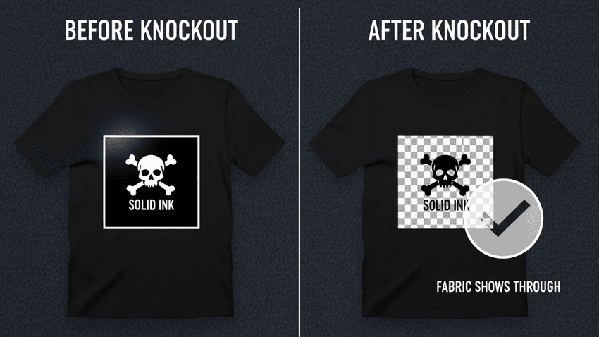
- The Concept: It’s not just about black ink on black shirts; it applies to all background colors. Instead of printing a rectangular image with a solid background color, you must remove the background entirely from your artwork. Let the fabric itself serve as the canvas and the negative space.
- The Benefit:
- No "Sticker Effect": By removing the rectangular background base, you eliminate the hard, boxy edges. The design no longer sits on top like a rubber patch but feels like it's "floating" on the fabric.
- Natural Blending: Without a solid base, the edges of your design can feather and fade naturally into the garment’s fiber, creating a high-end, integrated look rather than a sharp cutout.
- Superior Drape: Removing the heavy background ink reduces the print weight significantly, preserving the natural flow and softness of our heavyweight cotton tees.
Pro Tip: In Photoshop, use tools like Select > Color Range or the Magic Wand to select and delete the background color completely. Ensure your export (PNG) has a transparent background. The goal is to have ink only where the actual design elements are, with zero background fill.
3. Color Profiling: sRGB vs. CMYK
A common misconception in the printing industry is that all print files must be CMYK. For the cutting-edge Brother GTX600 systems we operate, this is incorrect.
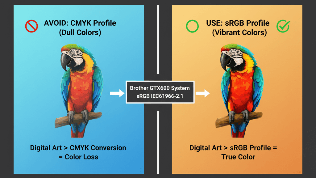
- The Standard: We calibrate our Brother GTX600 fleet to the sRGB IEC61966-2.1 color profile.
- The Why: The Brother GTX600 utilizes advanced Innobella Textile inks, which offer a significantly wider color gamut than traditional CMYK offset printing. Converting your vibrant digital art to CMYK often results in "muddy" colors and a loss of brightness.
- Action Item: Design in RGB mode and export as a PNG with the sRGB profile embedded. This ensures the closest possible match between what you see on your monitor and the vivid output of our GTX600 engines.
4. Bit Depth: Is Higher Always Better? (8-bit vs. 16-bit)
A common question from high-end designers is: "Should I export my files in 16-bit or 32-bit to get smoother gradients?"
The short answer is: No. Stick to 8-bit per channel.
Here is the technical breakdown of why 8-bit (Standard 24-bit RGB) is the gold standard for the Brother GTX600 workflow:
- The "Fabric Limit": While 16-bit color offers billions of color variations (great for high-end monitor grading), textile fibers are not smooth photo paper. The natural texture of the cotton creates a physical "noise" that renders the microscopic color differences of 16-bit files invisible to the naked eye.
- RIP Processing: Sending massive 16-bit files (which can be 500MB+ for a 24×24 canvas) slows down the RIP (Raster Image Processor) software without translating into extra ink droplets. It simply bloats the file size without adding printable value.
- The Trap of "Indexed Color": Be careful not to confuse "8-bit per channel" (Good) with "8-bit Indexed Color" (Bad, like a GIF).
- ✅ DO: Export as 24-bit PNG (which is 8-bits for Red, 8-bits for Green, 8-bits for Blue).
- ❌ DON'T: Export as 16-bit or 32-bit per channel (Overkill).
Why PODpartner?
We didn't just tweak a standard machine; we re-engineered the entire manufacturing workflow to support high-end brand creation.
- Powered by Brother GTX600: We utilize the latest industrial-grade Brother GTX600 printers. Unlike older systems, the GTX600 features industrial print heads with internal cooling fans, allowing for continuous, high-speed printing at 1200 dpi resolution—even on a massive 24″×24″ canvas.
- True 24″×24″ Capability: Not 12″×16″, not 16″×21″. A full 24-inch square canvas that delivers true edge-to-edge impact.
- Mixed Media Mastery (DTG + Embroidery): While most competitors force you to pick either printing OR embroidery, PODpartner supports both on a single garment even single area. This mix of tactile embroidery and vibrant printing creates a sophisticated, multi-dimensional aesthetic that significantly elevates your brand's perceived value.
Ready to create your walking billboard?[Start Designing with PODpartner's 24″×24″ Jumbo DTG Today]
Further reading

No Order Minimums

No Membership Fees

No Unsold Stock

No Quality Concerns
Only Creativity, Satisfaction, and Profits!